details_title:
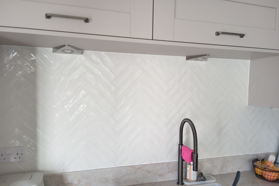
Herringbone splashback
details_subtitle:
Metro tiles, ceramic
details_entry:
It's all in the grout
details_text:
I must confess I have a bit of a bias against herringbone on walls. Contrary to common belief, the vertical use of opus spicatum is a relatively recent trend rather than a timeless design principle. I think the reason is that, when done poorly, it can look busy and pretentious.
That said, this particular herringbone splashback works well. Its success lies in how the grout is used. There’s a common assumption that the pattern requires strong contrast to stand out. Yet this often ends up looking unnecessarily forced.
The secret here is that we see the pattern not because the joints have a contrasting colour, but because of the way they reflect light—this is what gives the wall depth and subtlety.
details_contact:
details_image:
details_contact_last: